One of the most inspiring and influential events concerning interior design is taking place mid April on a yearly basis. Here come the most striking colours we, the R&D team, experienced while visiting the large variety of showrooms across the entire city of Milan as well as the fair itself.
Central colour themes and trends we saw were:
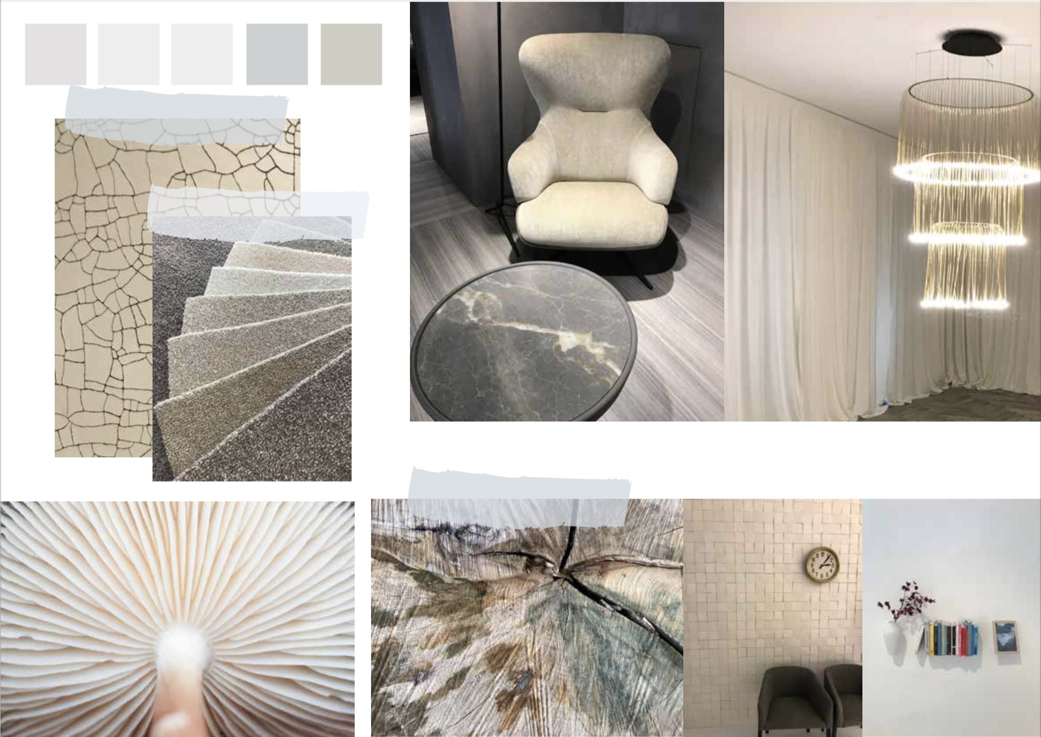
Offwhites
A variety of white-bone-oyster tints combined with each other. Subtle, elegant and understated.
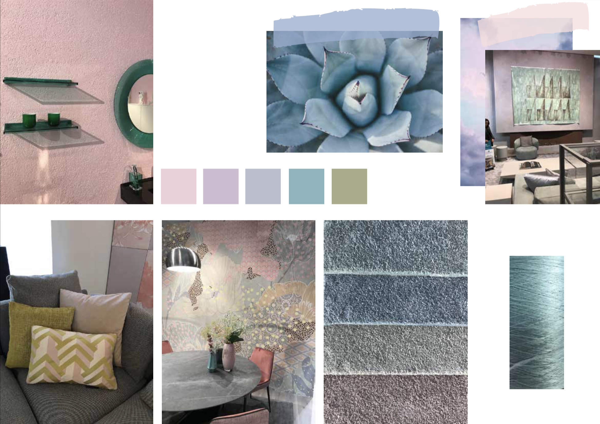
Pastels
Rose, lavender, ice blue and aqua tints and light mustard stands for a new beginning.
Birth, hope and clarity.
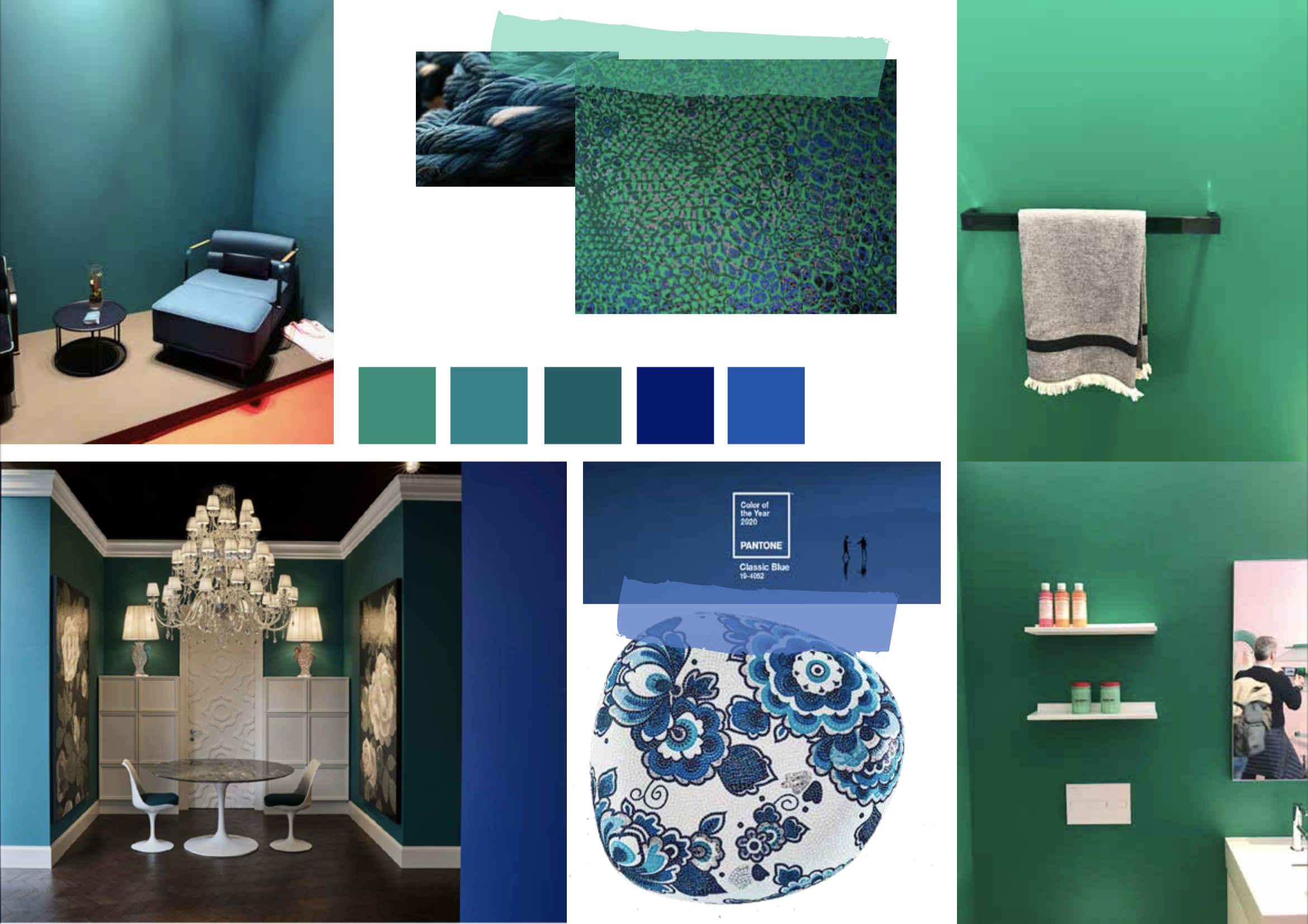
Green and Blue
Counterweight to the light pastels. Fresh, pure, stable and dependable make us feel confident.
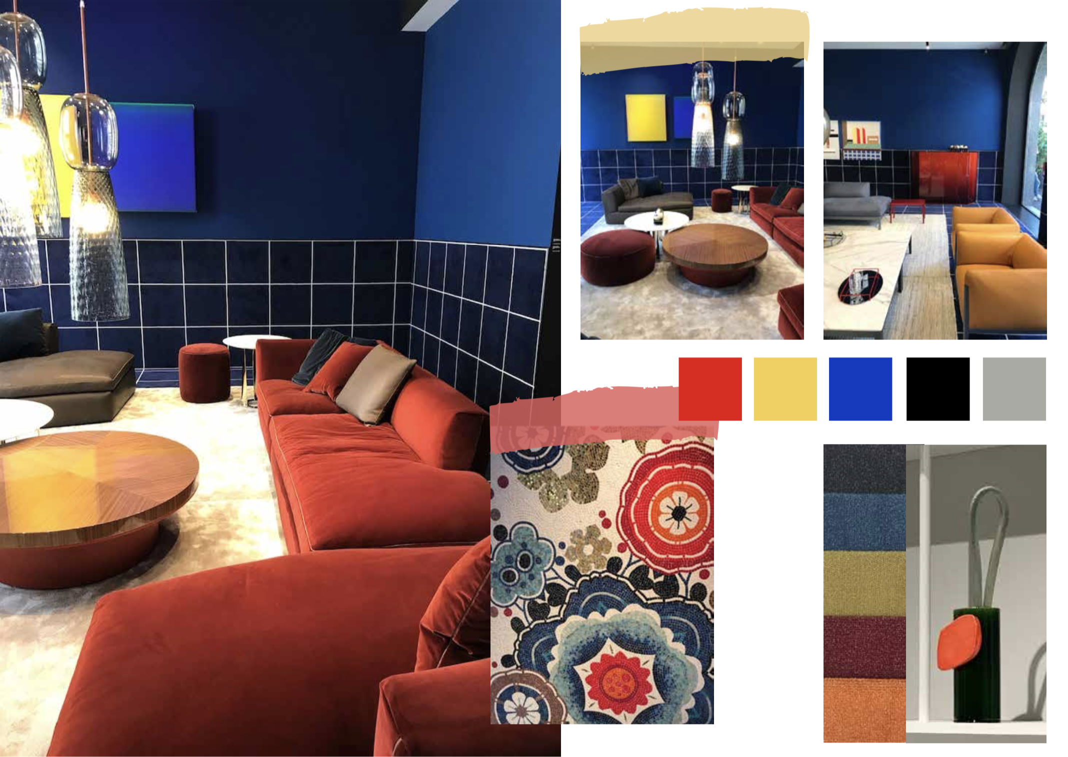
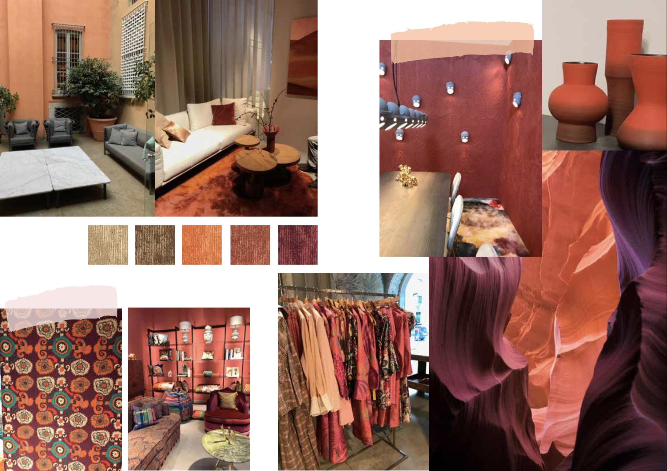
Terracotta
Warm, feminine, ton sur ton, rich, comfortable, offering refuge.
Primary colours
Citrus and acidic yellow, carmine red, cobalt and indigo blue combined with black, grey and white.
Clear, honest, 100 years of Bauhaus, simple but brilliant.